Spread Design
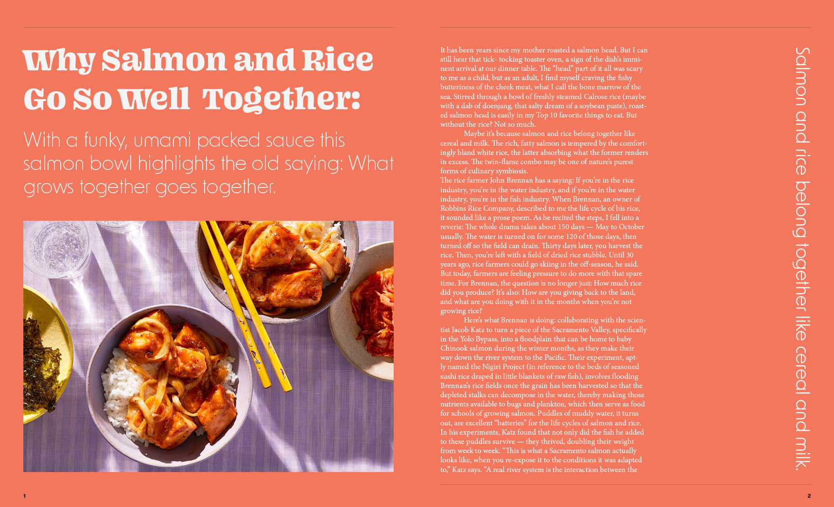
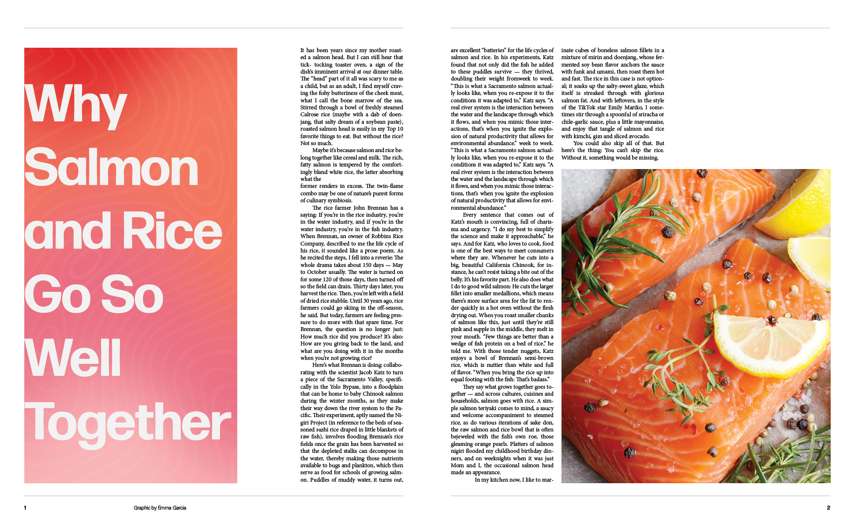
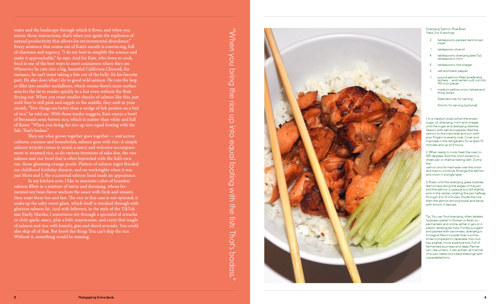
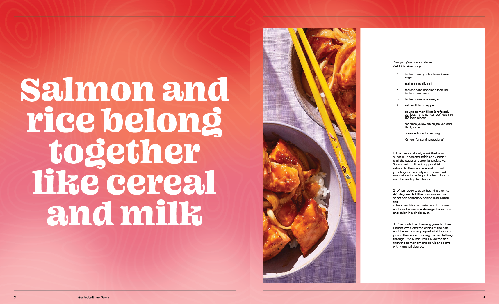
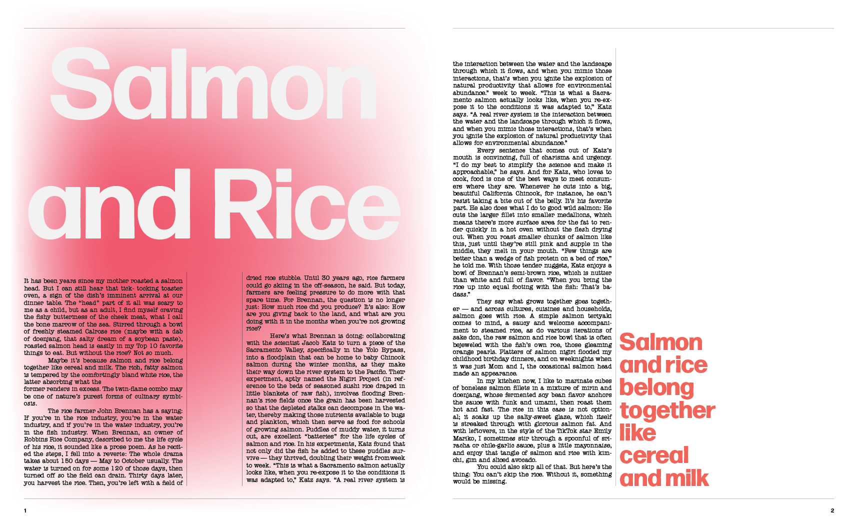
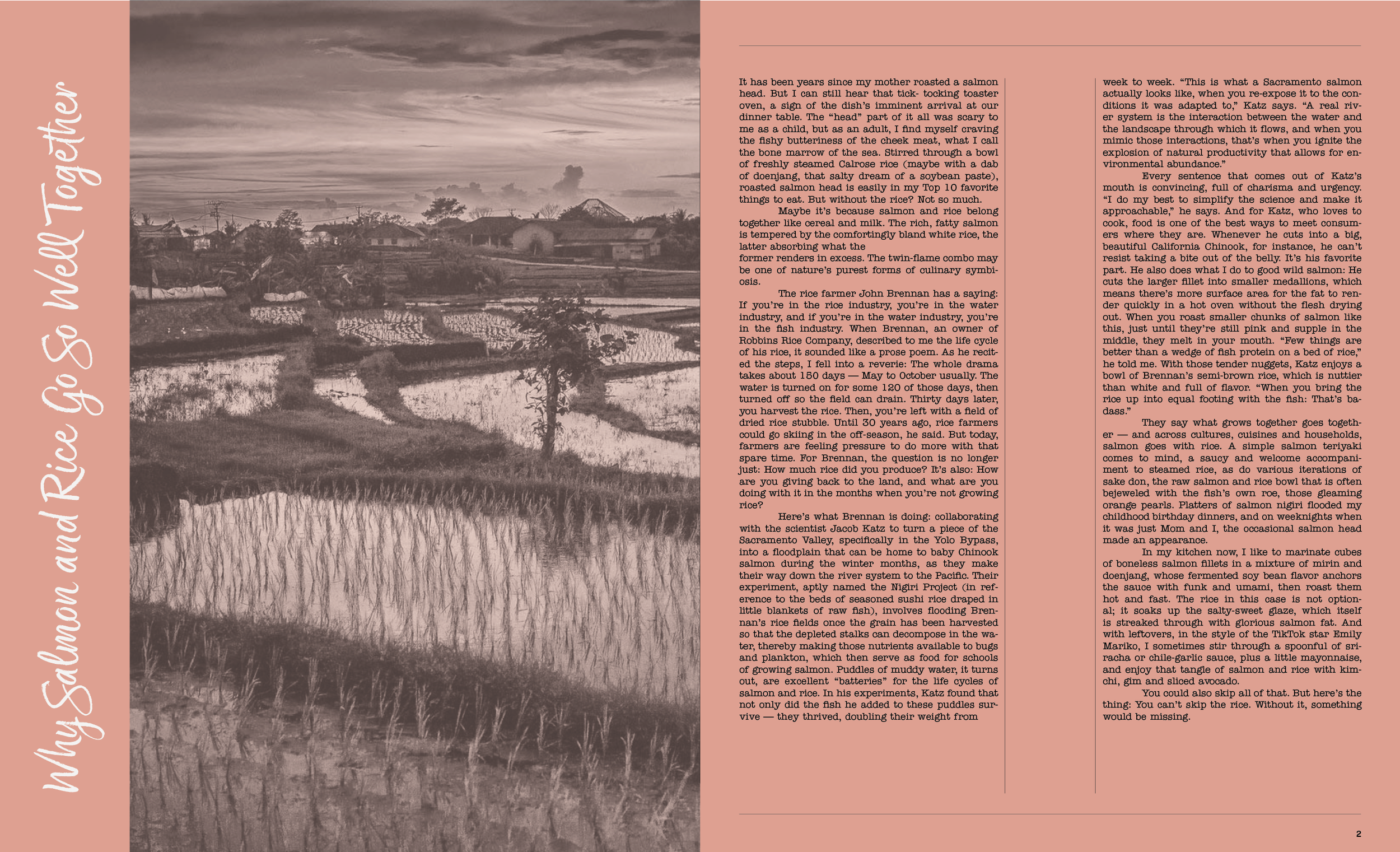
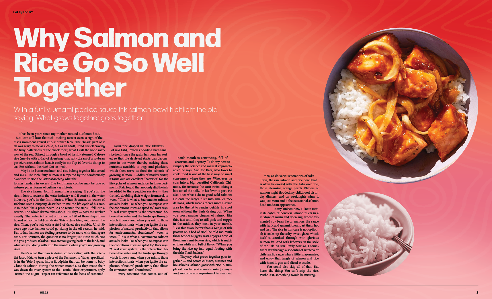
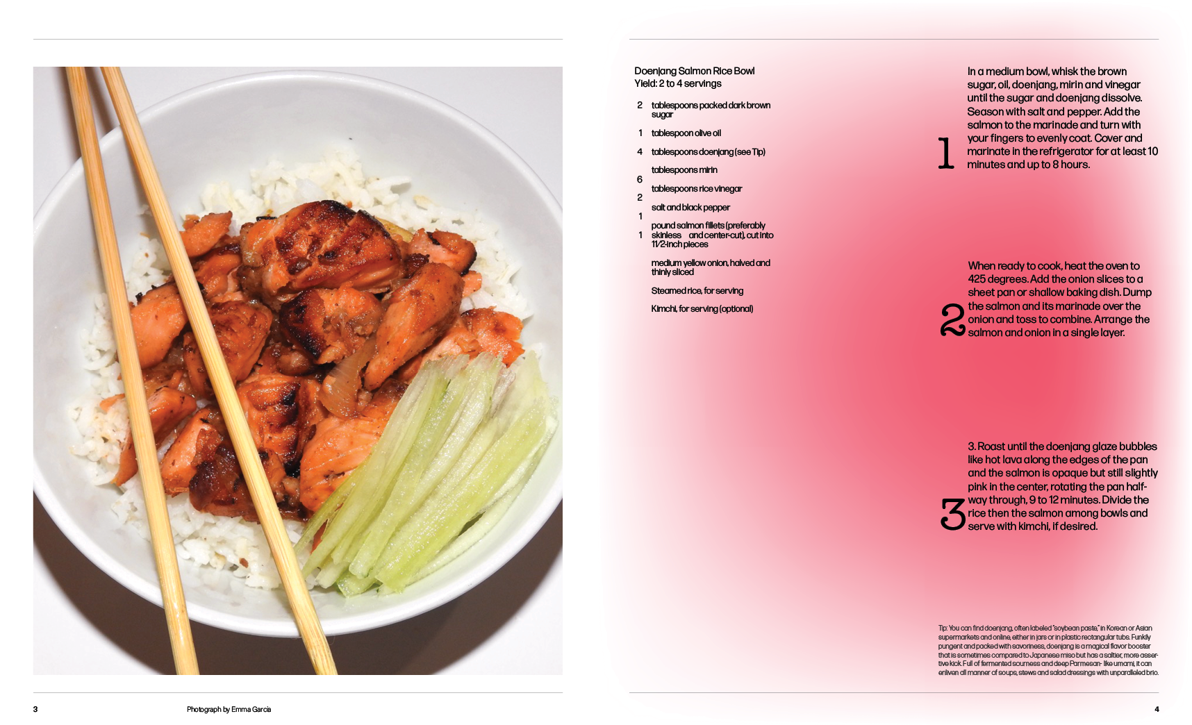
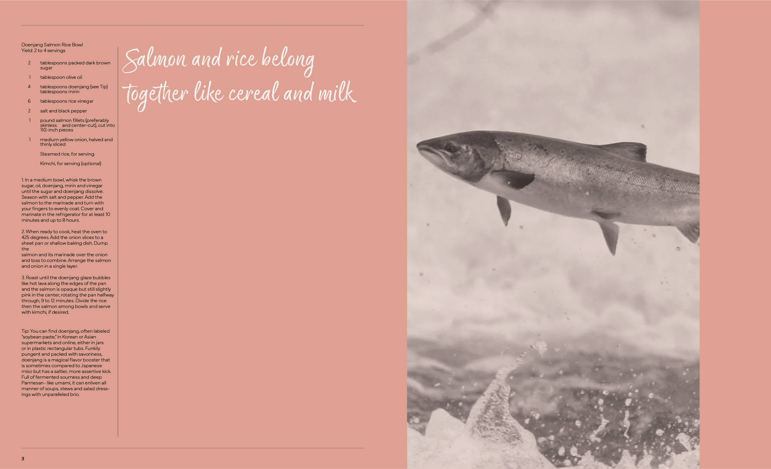
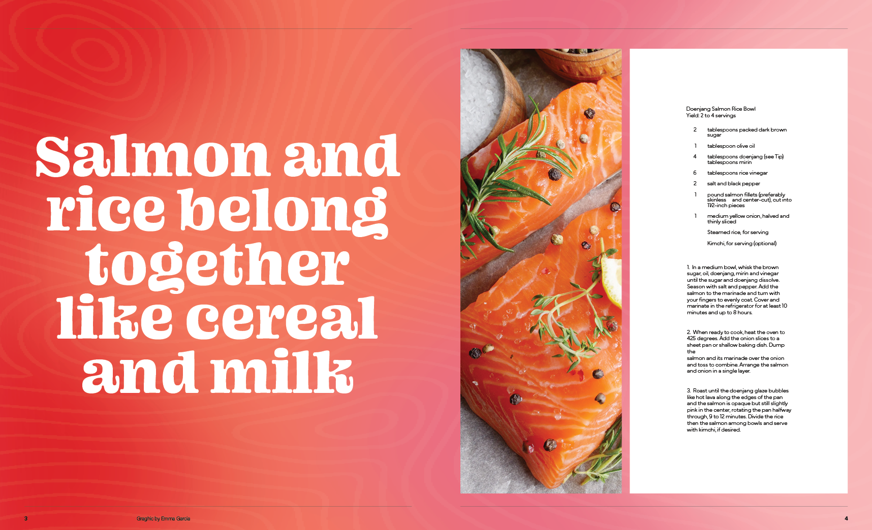
For this project, I created a NY Times Eat spread based on a pre-existing article and recipe. The article of my choice is about the Doenjang Salmon Rice Bowl. The article talks about how rice and salmon go so well together, along with what the recipe means to the writer. I came up with three main concepts heavily inspired by the taste of the dish and its ingredients.
Concepts
Concept 1
The Union of Salmon and Rice. I was inspired by the rice fields used to grow salmon and how something that grows together goes so well with each other. I referenced the patterns of the rice fields in the type, as well as the colors pink and green which are opposite on the color wheel making them complementary colors, symbolizing the union of the two ingredients.
Concept 2
Heavily inspired by salmon spread. This design direction references the colors and patterns of salmon-like fat marbling. The font is flowy and rounded to represent the curved movement salmon makes when swimming.
Concept 3
All about the rich taste of the dish itself. The dish has a deep, funky, umami taste to it. I wanted to represent these tastes using different shades of browns, colorizing the imagery, and having a big bold type to represent the strong flavor of the dish.


